If you’re planning to launch your real estate business website in 2020, or you’re a developer who got a project to build a real estate website, then this blog post is really going to help.
The following are some of the best real estate websites that you may want to check out for design ideas and inspiration before you start building yours. Moreover, all the sites are modern and have a distraction-free design, which soothes the visitor’s eyes and mind.
All the real estate websites mentioned in this blog post are not in any ranking order.
1. Australian Real Estate Company
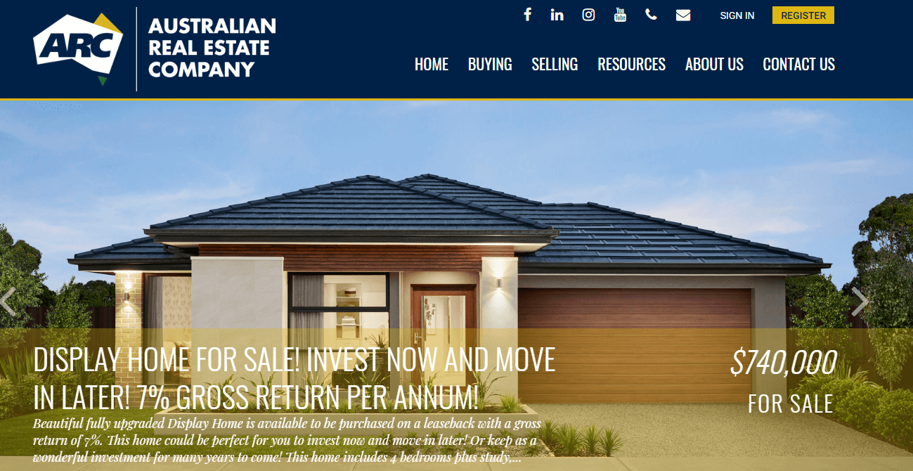
AREC has a clean design, which users find easy to navigate through the website. Hero section has a slideshow of the latest properties listing on sale. The header menu keeps every link organized, and it also has social link icons along with user account sign-in. CTA for registration. Filterable property listing. What’s best in the Australian Real Estate Company’s website is that its latest properties section has subtle hover effects on properties images. This feature attracts users more than anything.
If you’re a real estate business person having lots of properties to list, then the AREC website’s design is the best suit for you.
2. Real Step
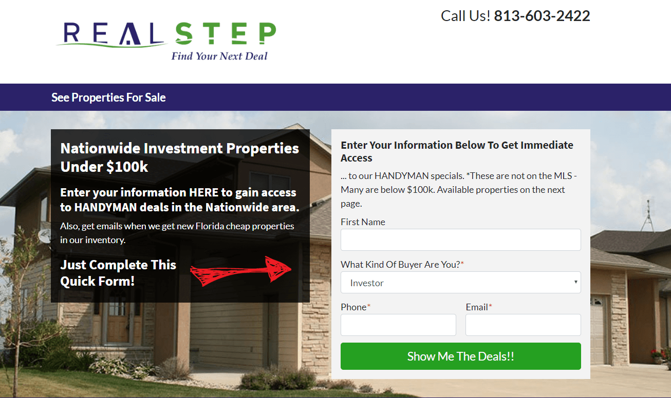
Another excellent example for your real estate website is Real Step. They, too, have a cleanly designed website with a home page full of useful details about real estate. Its above the fold area has a contact form to provide users exclusive deals on houses and lands. It’s a great way to increase your subscription list. Moreover, on the header, they have a single menu link to the property page. It’s good if you’re a realtor who doesn’t want to waste the user’s time. Above header, they have a logo and contact numbers side by side.
Similarly, the property page, too, is clean, which doesn’t bother the users, and they can smoothly go through the listing properties. Real Step’s property listing page got a filter menu. So, users can filter out properties based on locations, beds, baths, and more.
This website is right for you, whether you have a long list of properties or short. Moreover, designing it won’t take enough time, and you can establish your online real estate business profile pretty fast.
3. @realty
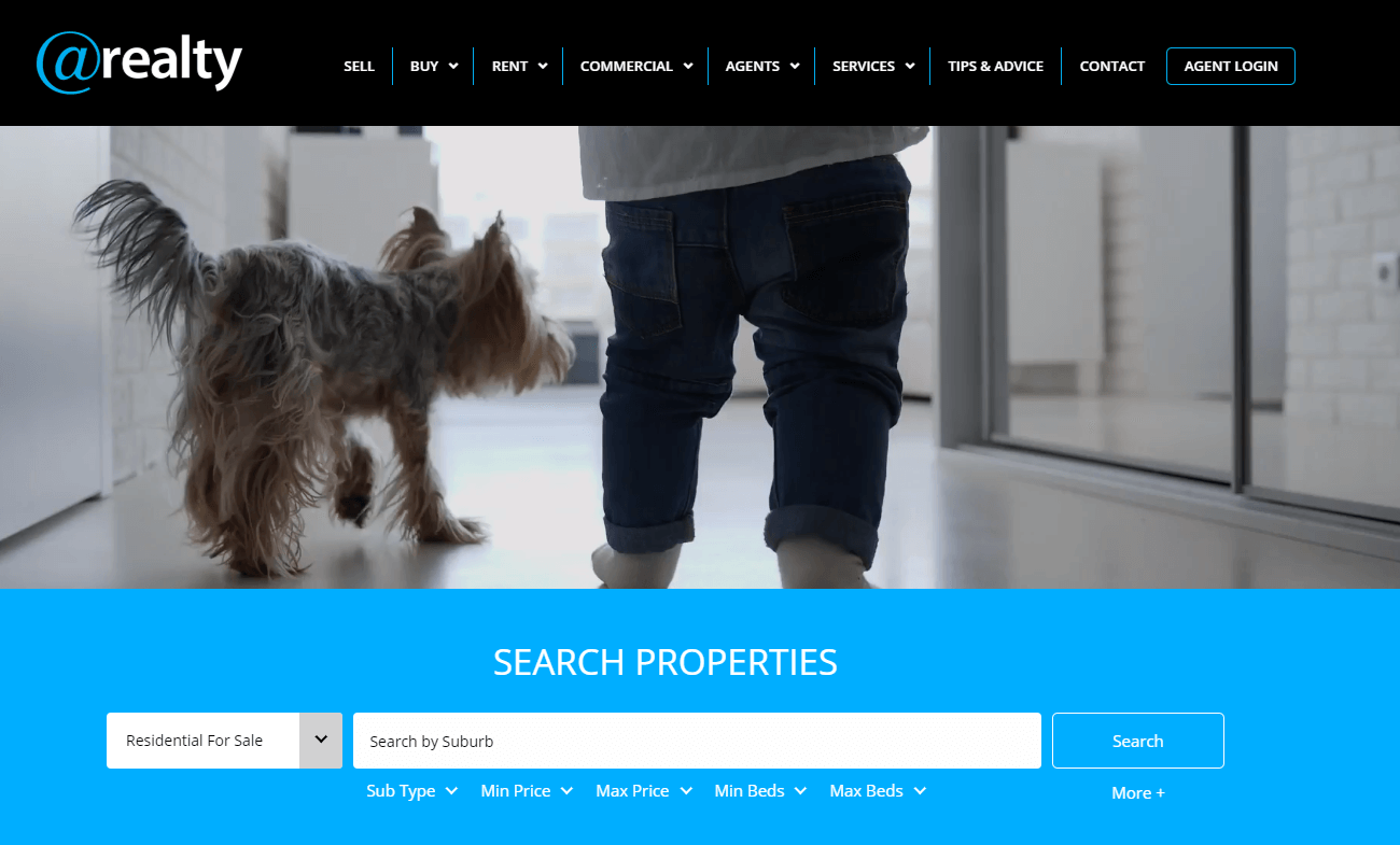
If you do more than just buying houses and lands, then this real estate website design is for you. @realty, too, has a clean website with a hero space having beautiful GIF art. It’s a good website design for agents who provides other services in the real estates business like renting, financial, property management, and more. Below hero space, you’ve got a helpful search bar. The filter option is actually good, nice and smooth. Plus, the section for services is also good, where you can use images. Header keeping all the menu items organized. Overall, a beautiful design to copy for realtors.
4. RE/MAX
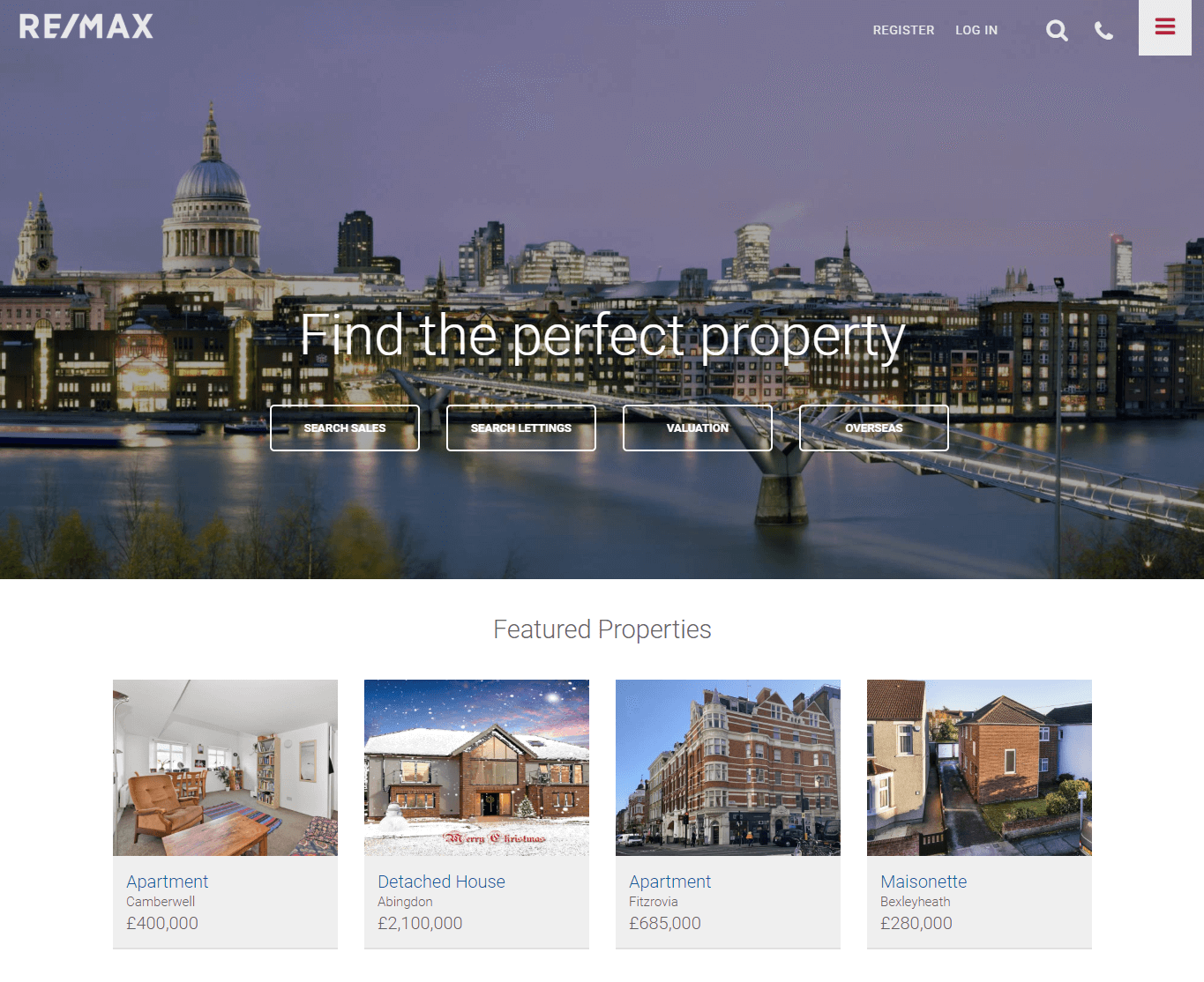
With a classic hero section, RE/MAX is one of the popular real estate websites. Transparent header with a beautiful menu sidebar along with login/register and call option. Plus, various buttons on the hero section to find the property featured property section. The homepage has beautiful blurbs for contact, buy a home, new home, and more.
The property listing with various filters like location, radius, min, and max price. Sort properties based on price, bedrooms, area, the latest listed properties, and status.
The best feature of listing properties is the listing view. Users can view properties in map view, list view, and grid view — perfect website design for a prominent real estate company.
5. Rawlins Estates
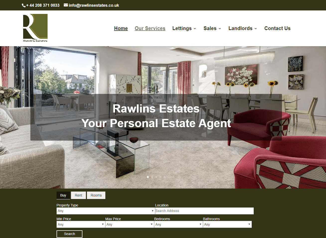
A clean and purposeful designed website for real estate agents, Rawlins Estates. The design of this real estate website is easy to implement and perfect for any kind of real estate company. It has a substantial sliding hero area, where you can display featured properties. Top secondary menu with the contact number and email address. Beautiful and ample header keeping each menu item in place with a hover effect.
Below the slider, you get a property search menu with multiple filter options. The homepage got multiple sections to add detailed information about your company or add links to the property listing pages. Add client testimonials and more. Separate pages for letting, sales, and landlords. Nice property list view listing with custom taxonomies.
6. MLS
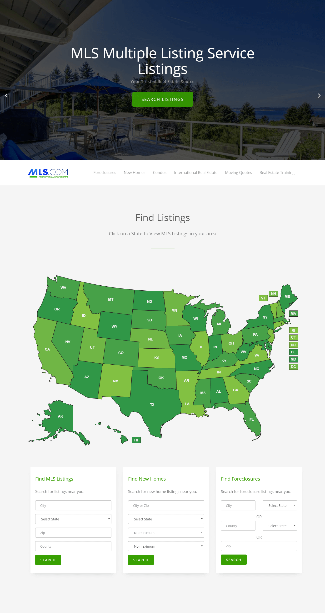
For a massive list of properties on sale, MLS’ website design is perfect. And another good reason to include the MLS website in this list is its map view. To see listed properties, the user only has to hover to the state name on the map and click it. Properties would show up. Also, it supports referring to other realtors’ websites. So, if you got a good connection in the real estate business, then this website is perfect for you. You can also search properties by filling the details in the search form.
7. Ugly Houses RI
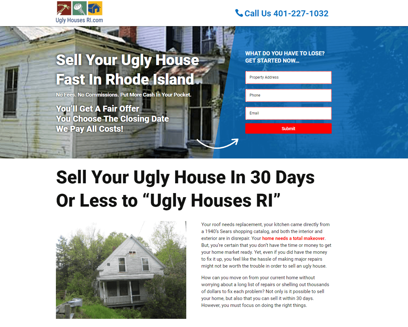
Ugly Houses RI has a minimal designed single-page website with multiple contact forms on the page. The concept behind this kind of design is to get people- who want to sell their houses- submit their details on the website and then later contact them with an offer. So, if you’re in this type of business where you don’t list any property and only interested in buying people’s houses, then this website design is right for you. Reason? It has minimum design, more content, fast page loading speed, and better rank on the search result page.
Final Thoughts
These are our 7 top designed real estate website. All are good in both design and feature perspective. You can get inspiration from one site or mix up features of every website to create your new and unique real estate website. Design all by yourself or hire a professional real estate website developer. If you liked this post, then please share it and write your views about what you think about all the mentioned websites in the comment section.





0 Comments